
Introduction:
Color isn’t just visual—it’s emotional, psychological, and powerful.
The right brand color palette can attract your ideal audience, build instant trust, and make your brand unforgettable.
In this guide, we’ll show you how to choose brand colors using color psychology, strategy, and proven branding principles.
Why Your Brand Colors Matter
Color influences 85% of consumer buying decisions
Choosing the right brand colors is like designing your brand’s first handshake.
Your brand is more than a logo—it has a voice, a style, a feeling.
Match your colors with the emotions you want to evoke.
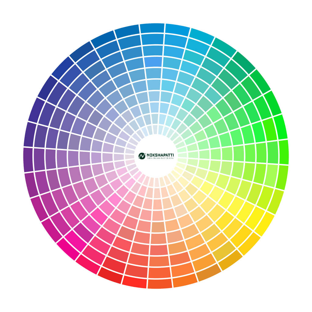
Brand Personality Color Examples Emotion Triggered Bold & Creative Red, Orange, Purple Energy, Innovation Calm & Trustworthy Blue, Green, Teal Safety, Balance Elegant & Premium Black, Gold, Navy Luxury, Authority Organic & Natural Olive, Beige, Brown Earthy, Honest
Your colors must resonate with your target customer:
Match the emotion of your brand with the aspiration of your audience.
What colors dominate your niche?
What gaps can you fill with your color story?
Choose 3 types of colors to create a powerful palette:
Keep it consistent across your website, social media, and packaging!
Want Expert Help?
Need a professional touch to find your brand’s color story?
🎨 Contact Nokshapatti — We specialize in crafting color palettes that spark emotion and elevate brands worldwide.
 Color influences 85% of consumer buying decisions
 Identify Your Brand Personality
 Pro Tip: If your brand blends heritage with design (like Nokshapatti), try deep green, rust, or warm neutral tones to evoke trust and craftsmanship.
 Know Your Ideal Audience
 Teens & Gen Z → Vibrant, expressive tones (Neon, gradients)
 Wellness or Beauty → Soft, pastel colors (Lavender, Blush)
 B2B or Corporate → Solid, trustworthy colors (Blue, Gray, Navy)
 Eco-friendly → Greens, naturals, terracotta
 Spy on Your Competitors (Then Do It Better
  )
) Build Your Brand Color System
 Primary Color – Your main brand color (most visible)
 Bonus Tips for Color Success:
 Always check for contrast and accessibility
No responses yet